UI/UX Case Study

Stillwater.
UI for a Meditation Platform.

We transformed a cluttered utility into a serene digital sanctuary, reducing cognitive load and increasing session retention through thoughtful design.

A mobile phone screen displaying the Stillwater meditation app interface with soft sage tones and clean typography
🌊
Complete UI Redesign
Mobile App • iOS & Android
The challenge

From Functional to Focused

Stillwater, a growing meditation platform, had a functional app, but it felt stressful. Users were overwhelmed by navigation options and information density.

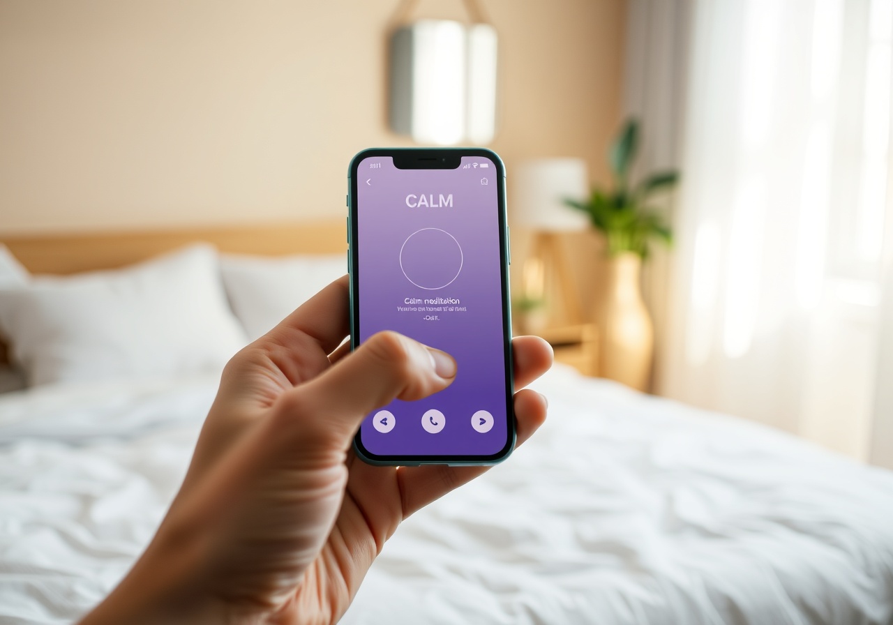
Our goal was to strip away the noise and create a UI that felt like taking a deep breath. We moved from a dense, information-heavy interface to a minimalist, whitespace-rich environment that guided users effortlessly from "awake" to "asleep."

The result was a platform that didn't just offer meditation; it offered a respite from the digital world, aligning perfectly with Stillwater's mission of inner peace.

Discovery & Research

Grounded in Data

Every design decision was backed by user insights and rigorous analysis.

🧘

User Interviews

Conducted 25 in-depth interviews with existing users to identify friction points in the current onboarding and navigation flow.

🔍

Competitive Audit

Analyzed Calm, Headspace, and Insight Timer to identify gaps in Stillwater’s value proposition and UX patterns.

Accessibility Audit

Ensured WCAG 2.1 AA compliance for color contrast, text sizing, and screen reader navigation paths.

Information Architecture

Flow that flows

We restructured the app's navigation hierarchy to prioritize the user's immediate need: meditation. By reducing the number of taps required to start a session from 5 to 2, we minimized the decision fatigue that often prevented users from beginning their practice.

Key User Flow Changes

  • Consolidated "Explore" and "Library" into a single, card-based discovery feed.
  • Implemented a persistent "Now Playing" bar with one-tap resume functionality.
  • Removed secondary menus during active playback to maintain immersion.
Visual System

The Language of Calm

Color Tokens

We moved away from stark whites to a system based on Sage and Oat tones, reducing eye strain and evoking nature.

Primary: Sage / Background: Oat / Text: Ink

Typography & Icons

A fluid type scale using Cormorant Garamond for headings creates a sense of elegance, while DM Sans ensures legibility for body text.

Serif Display
Sans-Serif Body
Wireframes & Prototyping

From Paper to Prototype

We began with low-fidelity wireframes to establish the information hierarchy, ensuring the logic was sound before applying visual polish. This phase allowed us to test the user flow with stakeholders quickly and cheaply.

The final high-fidelity prototype was tested with a group of 50 users. The feedback was overwhelmingly positive regarding the "ease of use," with a specific mention of the reduced visual clutter.

Outcome

Measured Impact

28%
Increase in
Session Completion Rate
4.8
App Store Rating
Post-Launch
0
Reported
Navigation Errors
120+
Hours Saved in
User Onboarding
Handoff

Seamless Development

We provided a comprehensive developer handoff package including auto-layout Figma files, a strict design system documentation (tokens, components, and spacing scales), and a "Design Tokens" JSON file to ensure pixel-perfect implementation across iOS and Android.

Ready when you are

Let's shape something beautiful together.

Tell us about your brand and what you're reaching for. We'll hold space for the conversation and explore what's possible.