Petal Nutrition
Brand Identity & Campaign
From packaging structure to a digital launch that sold out in eleven days, we helped a plant-based nutrition brand bridge the gap between botanical science and approachable beauty.
The Challenge
Petal Nutrition approached Synckit with a clear mission but a complex identity gap. They needed packaging and a launch campaign that felt simultaneously botanical and scientifically trustworthy.
The Strategy
We positioned Petal as 'Botanical Science Made Beautiful.' This meant moving away from the sterile 'lab coat' aesthetic toward something warm, earthy, and accessible—bridging the gap between raw ingredients and refined consumption.
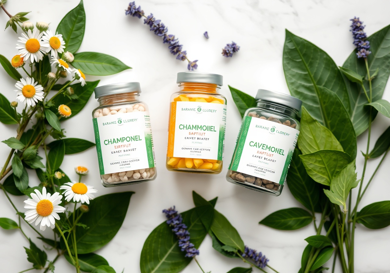
Packaging & Design
A holistic approach to creating a tangible experience.
Structural Brief
We developed a matte-finish, 100% recycled paperboard tube that feels premium yet sustainable. The form factor was designed to be refillable, aligning with the brand's eco-conscious values.
Label Design
Hand-drawn botanical illustrations paired with clean sans-serif typography. We created a system that feels organic but readable, ensuring ingredients are listed clearly.
Color Coding
A 3-tier system (Turmeric for immunity, Spirulina for energy, Ashwagandha for calm) using earthy ochres, deep greens, and slate blues to guide the consumer intuitively.
Photography & Art Direction
We utilized natural light and organic textures like raw linen, unbleached cotton, and river stones to create a sense of calm. The goal was to make the product feel like a daily ritual, not a commodity.
- Natural light studio setups
- Macro details of ingredients
- Lifestyle shots in botanical settings
Digital Campaign
Extending the brand experience across social and email channels.
Instagram Content Kit
Created a seasonal feed plan with 12 reels and 24 static posts featuring lifestyle shots and educational graphics about superfoods.
Email Sequence
Drafted a 5-part nurture sequence focusing on 'The Science of Plants' and 'Incorporating Superfoods' into a busy lifestyle.
Landing Page
Designed a minimalist one-pager featuring scroll-triggered animations and a simplified checkout flow.
Launch Impact
First Production Run
Signups
Launch Week Rating
Revenue Goal
Synckit didn't just design a logo; they understood our soul. The packaging feels expensive, but the messaging is accessible. We've had more inquiries in one week than in the previous six months.
Let's shape something beautiful together.
Tell us about your project. We hold space for the conversation and explore what's possible at a pace that feels right.