Despite offering world-class programs, the brand lacked authority. The visual language was too soft, lacking the grounding presence required for a high-end destination retreat. We needed to shift the perception from 'nice' to 'essential'.
Case Study
Aura Retreat Center
A Full Brand Awakening
Create in Harmony. Deliver in Flow.
The Challenge
Outdated, generic, and disconnected.
Aura was struggling to stand out in a crowded wellness market. Their previous identity felt generic, failing to communicate the premium, transformative nature of their retreats.
Discovery
Understanding the landscape.
We began with a deep dive into Aura's ecosystem. Through stakeholder interviews with founders, lead instructors, and returning guests, we identified a core desire: authentic transformation.
A competitive audit of 15 similar retreat centers revealed a common thread: a lack of visual clarity. By mapping these competitors, we identified a gap for Aura to position itself as the 'wise guide' in the space.
Strategy
Defining the Archetype: The Sage.
We aligned Aura with the The Sage archetype. This represents wisdom, calm, and the pursuit of truth. The brand voice shifts from aspirational to educational and grounded.
Core Pillars
- Clarity: Removing noise to focus on the essential.
- Depth: Moving beyond surface-level wellness.
- Trust: Building authority through expertise.
Exploration
Three directions explored.
🌿
Organic Flow
Soft, rounded forms inspired by water and breath. A focus on fluidity and connection.
◈
Geometric Anchor
Sharp, structured lines representing stability and the architecture of the retreat.
◎
Minimalist Sage
A restrained palette of sage, oat, and clay. Focus on typography and negative space.
Deliverables
The final identity system.
Logo Suite
A monogram mark combining 'A' and 'R' with a subtle nod to the lotus flower. Available in full color, grayscale, and inverted.
Earth-Tone Palette
Deep Forest Green, Warm Sand, Charcoal, and Cream. A palette that evokes the natural surroundings of the retreat.
Typography
A pairing of Cormorant Garamond (headings) for elegance and DM Sans (body) for modern readability.
Brand Book
A comprehensive 40-page guide covering usage, tone of voice, and application across print and digital touchpoints.
Visual Direction
Photography for the new site.
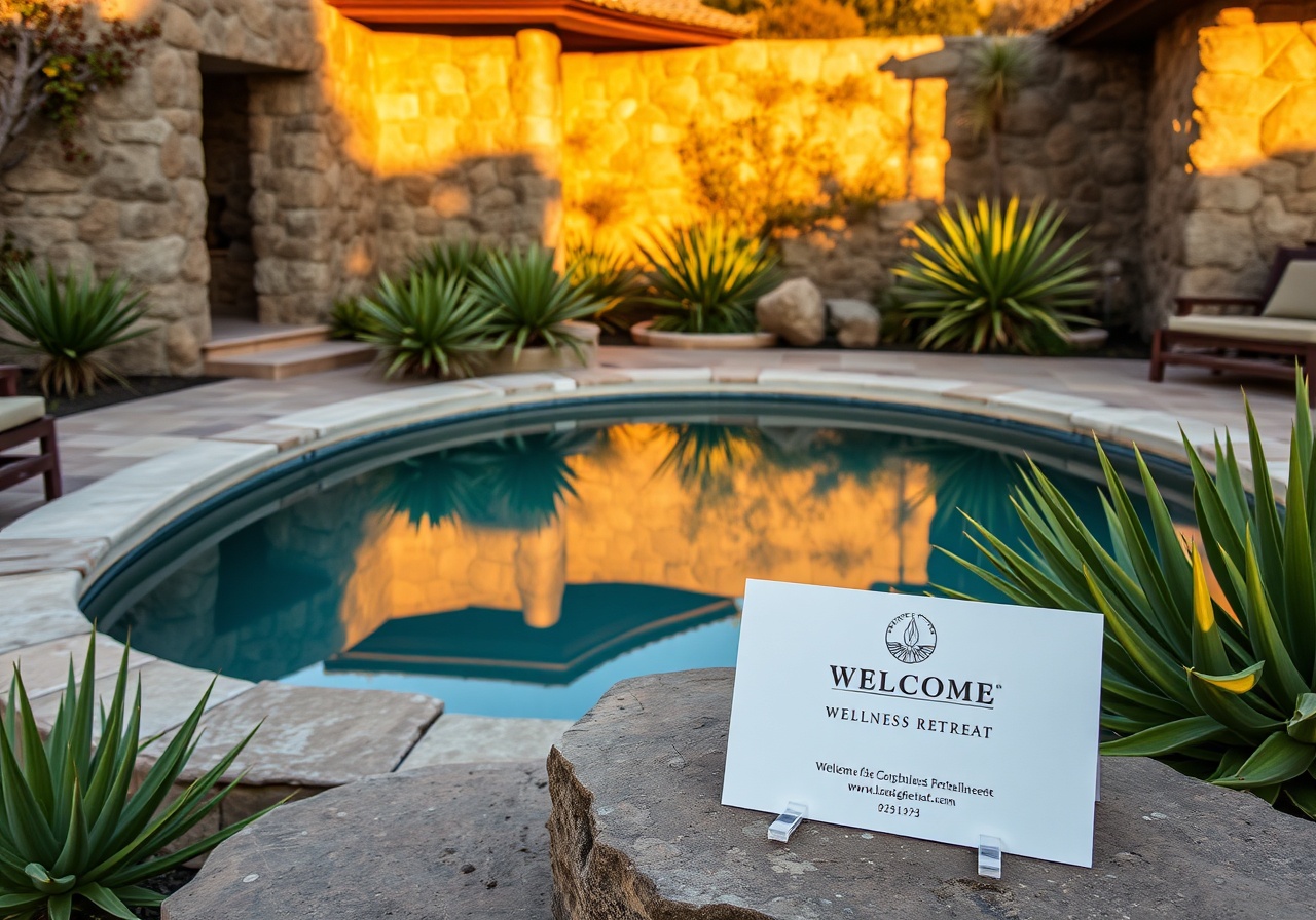
We directed a photography campaign focusing on authentic human connection and immersive environments. The goal was to capture the 'stillness' of the retreat experience.
Key directives included: natural lighting, candid portraits of guests in flow states, and macro details of the landscape. The imagery supports the 'Sage' archetype by showing wisdom in action.
Impact
Measurable outcomes.
40%
Increase in
retreat bookings
retreat bookings
2
Features in
wellness press
wellness press
100%
Client satisfaction
score
score
12mo
Ongoing
collaboration
collaboration
"Synckit didn't just design a logo; they helped us find our voice. The new identity captures exactly what Aura stands for—calm, wisdom, and transformation."
— Elena Rostova, Founder
Next project
Ready to awaken your brand?
We are currently accepting new clients for Q4. Let's create something meaningful together.