✦
The Art of Minimalist Branding
Why less is often more when defining your visual identity.
Read MorePractical advice for founders navigating the sea of sameness.
By Synckit Team • October 12, 2023
Walk into any wellness marketplace today, and you’ll likely see the same visual language: sage green, script fonts, and stock photos of people meditating in silence. It’s a sea of sameness that makes it nearly impossible for new brands to stand out.
But generic aesthetics are more than just a design trend; they’re a strategic blind spot. They dilute your message and make your brand forgettable. In a crowded market, distinctiveness isn’t a luxury—it’s a necessity.
Just because a font has a swash or a soft weight doesn't mean it fits your brand. A yoga studio's brand personality might be earthy and grounded, requiring a serif like Cormorant or a sturdy sans, while a high-end organic skincare line might benefit from something more geometric and modern. Prioritize legibility and personality over trend.
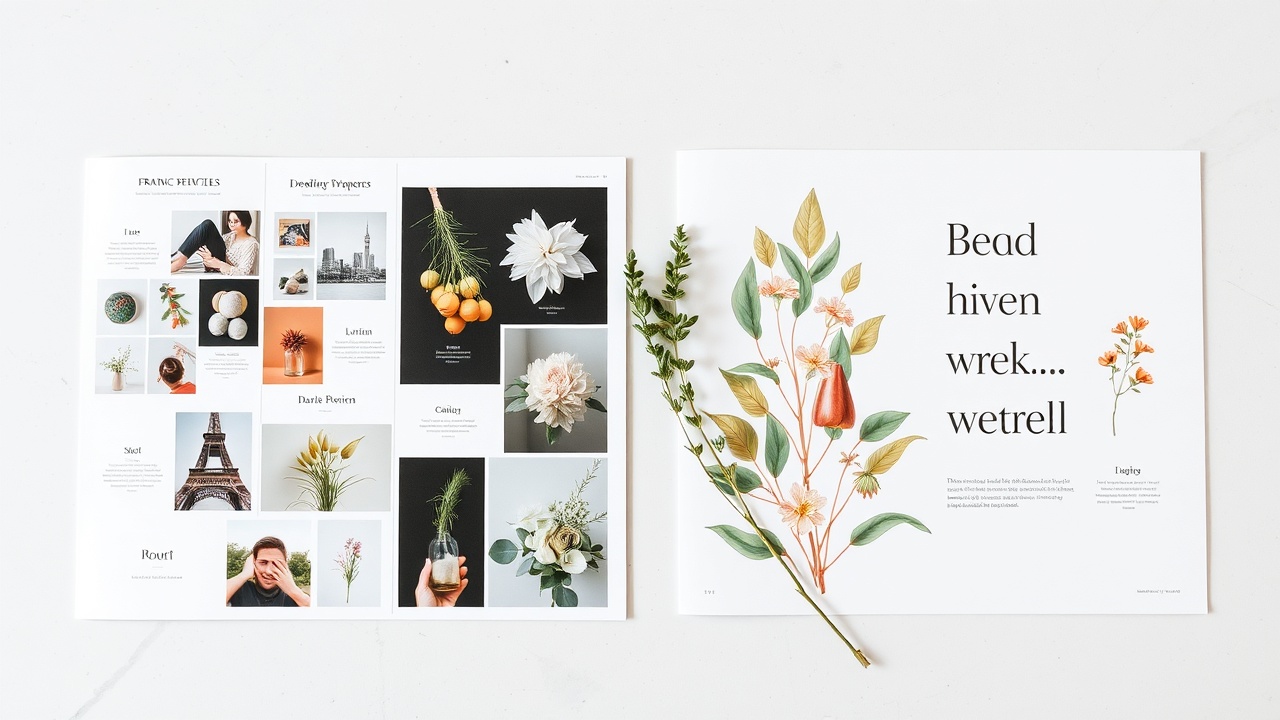
Search for "wellness" on any stock site, and you'll find 50 identical images of hands holding crystals or mats laid out on grass. Using these images signals that your brand is a commodity. Invest in custom photography or illustrations that show *your* specific products, your specific team, and your specific environment.
Trend reports tell you what people *are* buying, but they rarely tell you what your brand *is*. If your color palette is simply "sage green + beige" because it's trending, you are blending in. Your colors should reflect your brand's emotional truth—whether that's the warmth of clay, the freshness of eucalyptus, or the clarity of slate.
A logo that looks great on a billboard but looks like a blob on a business card is a design failure. Complex geometry, heavy textures, and thin strokes often break down when resized. Ensure your logo is versatile enough to be used on everything from a large website header to a tiny Instagram story sticker.
Visuals are only the tip of the iceberg. A generic brand might have a beautiful logo but a confusing tone of voice or a slow, unresponsive website. Does your copy breathe? Are your packaging textures inviting? Don't let your digital presence, tone, and physical touchpoints contradict the calm, intentional image you've built.
Take a step back and look at your presence with fresh eyes.
Ask yourself these three questions:
Start small. You don't need to overhaul everything at once. Focus on one touchpoint—your website header, your Instagram bio, or your packaging—and make it distinct.
Why less is often more when defining your visual identity.
Read MoreA guide to psychology in color for conscious businesses.
Read MoreUX principles that help your audience find peace online.
Read MoreReceive brand insights and studio updates in your inbox, once a month.